For this weeks journal entry I decided to go cute! To be honest I started the page without it actually being for this week! The page started out being the pages I used to clean my stencils after spraying my Dylusions inks through them. the colors that were there already had a fall feel to them and I went from there!
I wet the page and reactivated the inks and move them around a bit on the page then coated it with watered down gesso.
Then I went looking for what images I saw in the spots! I found this cute little guy! holding an acorn getting ready for winter!
I brought him out using craft acrylic paints and prismacolor pencils.
I love my journal! I can work in my journal with no fear of error because it will only be seen if I share it!
Hello All! I just thought I would share this process with you all, this is how I like to play with Dylusions spray inks. This is the process I usually follow when I am at a loss for inspiration but I want to create!
I have been using this process for quite a while but I never thought to share until I realized I had never seen anyone else use their sprays this way! I shared this video in some facebook groups I am a part of and could not believe the response I got! This is by far my most popular video on Youtube and I think I need to record my play time more often.
The reason I love this process so much is that it is soo uncontrolled, because I start with the black background I cannot see where the spray ends up very clearly and I dont see how the inks are mixing together, when I add the white to it and Smoosh the pages together I have no control as to how the white will lay on the page and what color ink it will attach itself to.
I hope you enjoy the video, if you have any questions feel free to ask! I am usually pretty good at answering them!
I am sorry in advance for this short post, but sometimes time is not in the abundance that I wish!
This weeks prompt was "Go to the Fair" I had the idea for a watercolor and ink like I had done in the past that I wanted to tweak and to make it better. I did this a few years ago for a art swap and I wish I would have kept it for journal! but I have the picture so I can try again and make it better, it was a lot of fun to make with the simple sunset sky and the black silhouettes. I will do it again I swear!
I did make a new piece this week, but I did it digitally! I love playing with Photoshop to create instead of just adjust images for printing!
For this piece I took about 6 different images and used some effects to get the great gradient shading then added the blue yellow and red to give the illusion of Electricity at the Fair!
I know it is simple but I think once I get it printed out and in my journal is will be a great addition to my creative collection!
Go over and check out what the other ladies have done with this weeks prompt over at Artful Chicks!
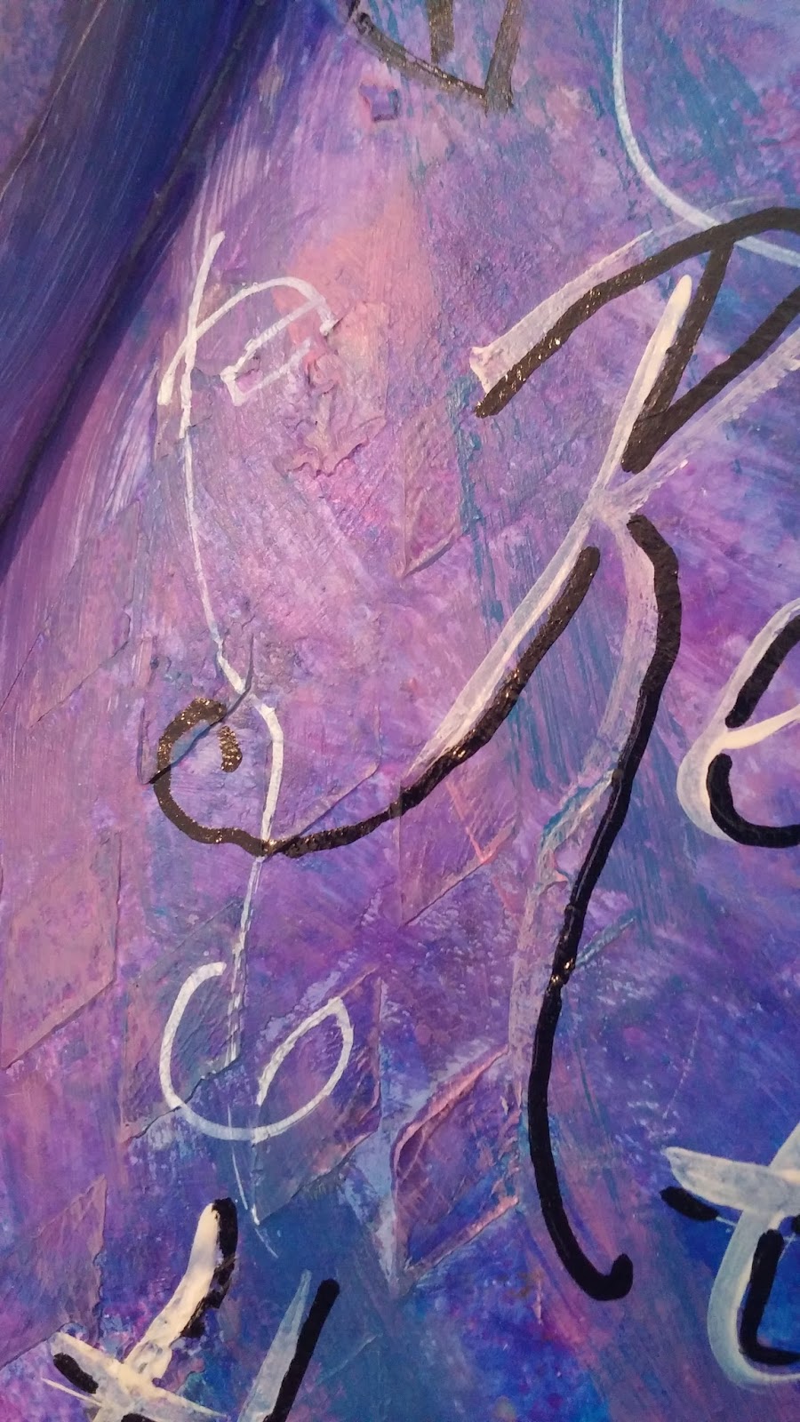
I love being an artist, but just like anything when you start worrying what other people like or what they will think it causes stress, I have actually ended up roadblocked in my creative process! The prompts from Artful Journeys are easy, I am not trying to make art that I think someone will want to buy, I am excepting a challenge to create a theme.
For years I have created without thought to what others liked, just what made me feel good, and I have sold many pieces! but suddenly with the need for income from my art I pretty much stressed myself out into creating mud... I have had enough of being stuck in my own head, I decided to get my journal out and create just for the fun of creating!
What I came up with is just a fun piece, Its not something anyone would want on their wall, I made it where it belongs, in my art journal. Its there to remind me that I have to make sure I enjoy what I am doing or I might as well go back to my desk job being stressed all the time working on deadlines and trying to find satisfaction in someone else's dream.
Art should be enjoyed not only by the person who views, reads or hears it, but also by the creator. I want people to see the love, joy, anger, sadness, remorse what ever I am feeling, that I put into my art and I have been trying to force myself to make happy sweet art when I am stressed out, that is not achievable for me!
So I just used all the art supplies I hadn't played with in a while and just chose the colors I wanted, giving no thought to the process, just being happy that my hands were getting full of color and I was ruining another t-shirt.
I just kept telling myself as I played, if it looks too bad Ill just throw a layer of gesso over it or cover it with papers. It turned out perfect for a journal.
And I feel much better!
Big Hugs and Mushy Stuff!
- Shana
Check out the video to see all the fun I had!
This weeks prompt "Dream Destinations" was an easy choice for my subject, Hawaii! To be honest I was in Hawaii once, for about a half hour! I was on a layover on my way to the Philippines so I got the wonder and awe of walking around the airport!
Flying over the islands and on our way in and our way out was magical! From my airplane window I got to see, Pearl Harbor, the beautiful landscapes and cityscapes, a whale in the wild for the 1st time, and a new island being formed from an underwater volcano eruption. it was beautiful! I think that because I never got to see it from the ground it is a place I really want to go.
I am in love with the Art Deco style and I attempted to recreate it, I used colored prismacolor pencils and acrylic paint to create the page as seen here. I like my girl and the floral pattern in the circle behind her but I think it was my color choices that made it not really feel Art Deco-ish, and on top of that I didn't plan ahead for a place to actually write "Hawaii" on it!
So I went to the other Artful chicks asking for help, actually is was more like "HELP!" I received awesome ideas from the ladies, but the one I hadn't thought of was digitally altering it!
I took this photo of my page and uploaded it into my photoshop program, Originally I was just going to add text, but when I went scoping the internet for inspiration I decided to go a slightly different route trying to work the Art Deco style I wanted back into the piece.
I used some vintage Hawaii brochures and postcard images and cropped them down put for the green and blue spaces, I then brought the opacity down to about 60% so that they didn't overshadow my hula girl and I love how it turned out!
The page still doesn't have the full Art Deco feel I wanted but I think I got some of the style back that I was looking for as well as adding some depth to the piece,
I hope you enjoyed my very basic review of my process!
If there is ever anything you would like more details on in my process ask and I will see what I can do!